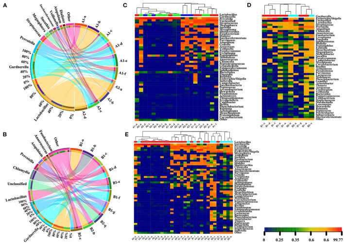
Figure 6.
The dominant flora and heatmap of genera from the tree diagram. The dominant flora in premenopausal (A) and postmenopausal (B) groups. The difference in abundance in samples on a branch is compared using a colored pie chart. Different colors represent different samples, and the larger the fan area of the color, the higher the abundance of the sample on the branch. The semicircle on the right indicates the species abundance composition of the sample, while the left semicircle indicates the proportion of different samples in the dominant species. The length and width represent the abundance and distribution ratio of species in the sample. Heat map of the top 50 species classifications at the genus-level species abundance matrix from a tree diagram. The distribution of flora in different phases of the menstrual cycle and postmenopausal women is shown in premenopausal women (C), postmenopausal (D) and both (E) groups. The same sample group has the same color. Each column in the figure represents a sample, and the row represents the community structure. The color blocks represent relative species abundance values. The redder the color, the higher the relative abundance, while the bluer the color, the lower the relative abundance. The color shade reflects the abundance of the community distribution, and clustering reflects community similarities and different distributions at each classification level.

