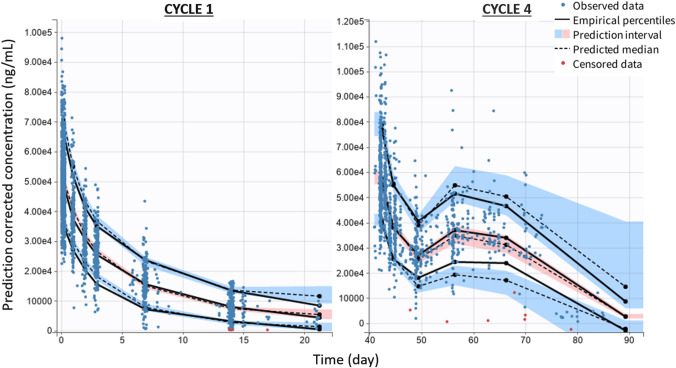
Fig. 2.
SAR408701 prediction corrected VPC at cycle 1 and cycle 4. The points represent the observed concentrations (in red the BLQ values, handled as censored data), the solid lines represent the median, 10th and 90th percentiles of the observed data and the blue and red areas represent the prediction intervals for each percentile (at a level of 90%). The shape of PK profiles may differ at cycle 4 because of dose delay that can be found across cycles for some patients

