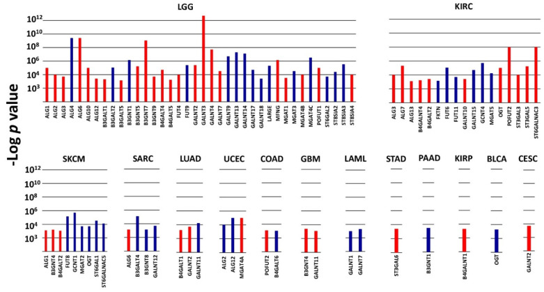
Figure 1.
VHPV in TCGA cohorts. Histograms represent the −Log of the p value for the comparison between the overall survival curves of the 15% higher expressers of each glycosyltransferase gene and the 15% lower expressers. Color labels indicate the association with a bad (red) or good (blue) prognosis. p < 1 × 10⁻³ was arbitrarily set as the threshold limit for inclusion. Cohorts not present in the figure did not contain any VHPV enzymes.

