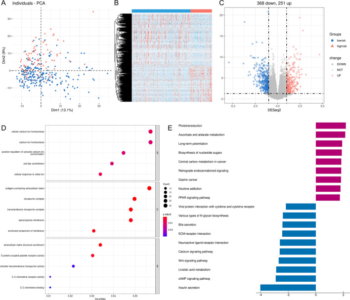
Fig. 6.
Identification and functional enrichment analysis of the DEGs between the two risk groups in the TCGA cohort. A PCA plot based on the DEGs. B The heatmap shows the expression level of the DEGs between the two risk groups. Red indicates higher expression, and blue, lower expression. C The volcano map shows the number of upregulated and downregulated genes in the high-risk group. Blue represents downregulated genes, and red denotes upregulated genes. D The bubble graph for GO enrichment analysis shows the function of the DEGs. BP: biological process; CC, cell component; MF, molecular function. The bigger bubble indicates the more genes enriched, and the increasing depth of red indicates the differences were more obvious. E The barplot graph for KEGG pathways. The left bar indicates the pathways enriched by the downregulated DEGs, and the right bar indicates the pathways enriched by the upregulated DEGs. The longer bar indicates that the differences were more prominent

