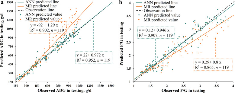
Fig. 4.
Relationship between the observed vs. the predicted ADG (a) or F/G (b) from the best-fitted models using testing data set. The best-fitted models were the MR and ANN models generated in training. 119 observations in the testing data set were used in this figure. Each plot represents a sample with observed value and predicted value from prediction models. The green line was the fit line of ANN predicted values while the yellow line was the fit line of MR predicted values. The slope of the fit line which is closer to 1 indicated a lower prediction error of the model.

