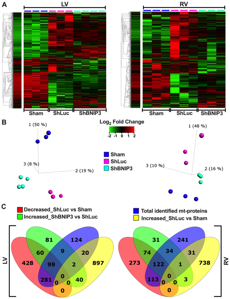
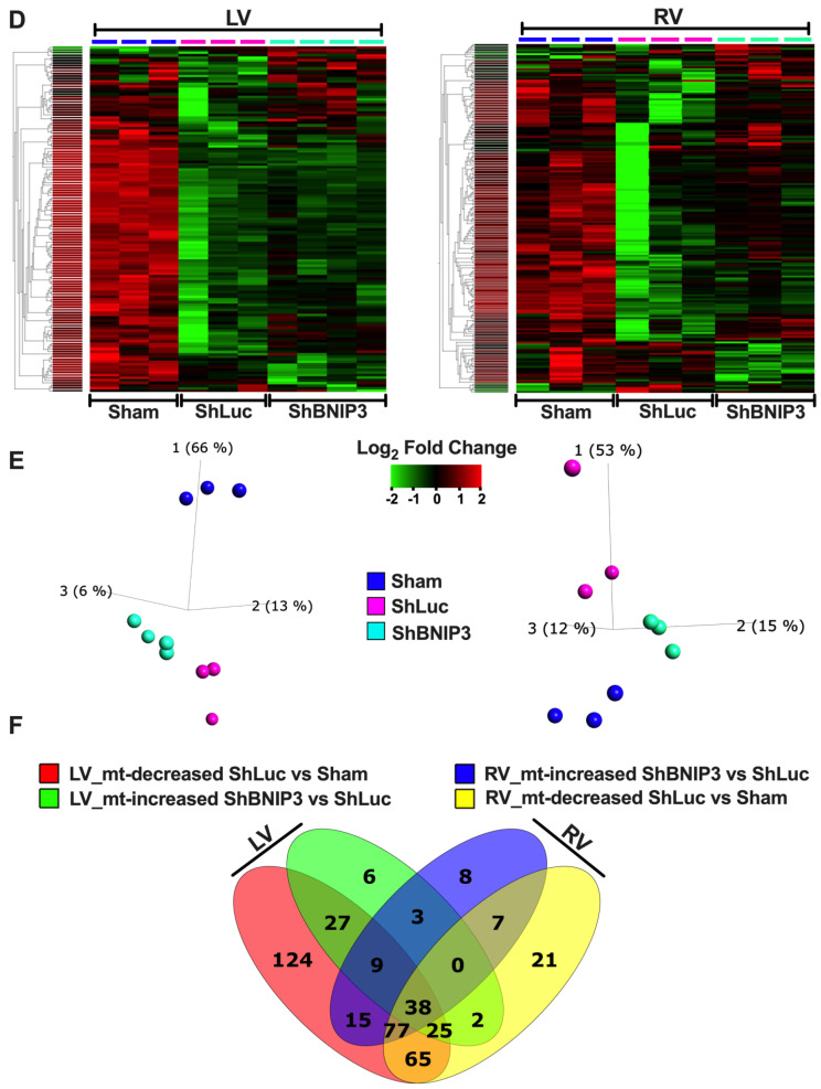
Figure 1.
Visualization of the differentially expressed proteins in ShBNIP3 vs. ShLuc groups in the LV and RV myocardium proteomic datasets. (A,B). Heat maps and PCA plots show the relative log2-fold expression and the variance in biological samples, respectively, in Sham and HFrEF, and ShLuc and ShBNIP3 groups of the differentially expressed proteins in ShBNIP3 vs. ShLuc in LV (left) and RV (right) shotgun proteomic datasets. (C). Venn diagrams show the number of proteins that were differentially downregulated (red) or upregulated (yellow) in ShLuc vs. Sham in LV (left) and RV (right) shotgun proteomic datasets, and how many of these were mitochondrial (mt)-proteins (intersection of blue with red or yellow diagrams, respectively). They also show the number of proteins that were differentially upregulated in ShBNIP3 vs. ShLuc (green), and how many of these were mt-proteins (intersection of blue with green diagrams). (D,E). Similar to A and B, with the exception that the heat maps and PCA plots represent the differentially expressed mt-proteins in ShBNIP3 vs. ShLuc groups. (F). Venn diagrams show the number of mt-proteins that were differentially downregulated in ShLuc vs. Sham (red and yellow), and those that were differentially upregulated in ShBNIP3 vs. ShLuc (green and blue) in LV and RV shotgun proteomic datasets, respectively. Note: the stand-alone column in the presented heat maps shows the hierarchical clustering of variables and the average log2-fold change in Sham biological samples. This is applicable for all the subsequently presented heat maps.


