
Extended Data Fig. 6. GEX cluster distribution for each sample.
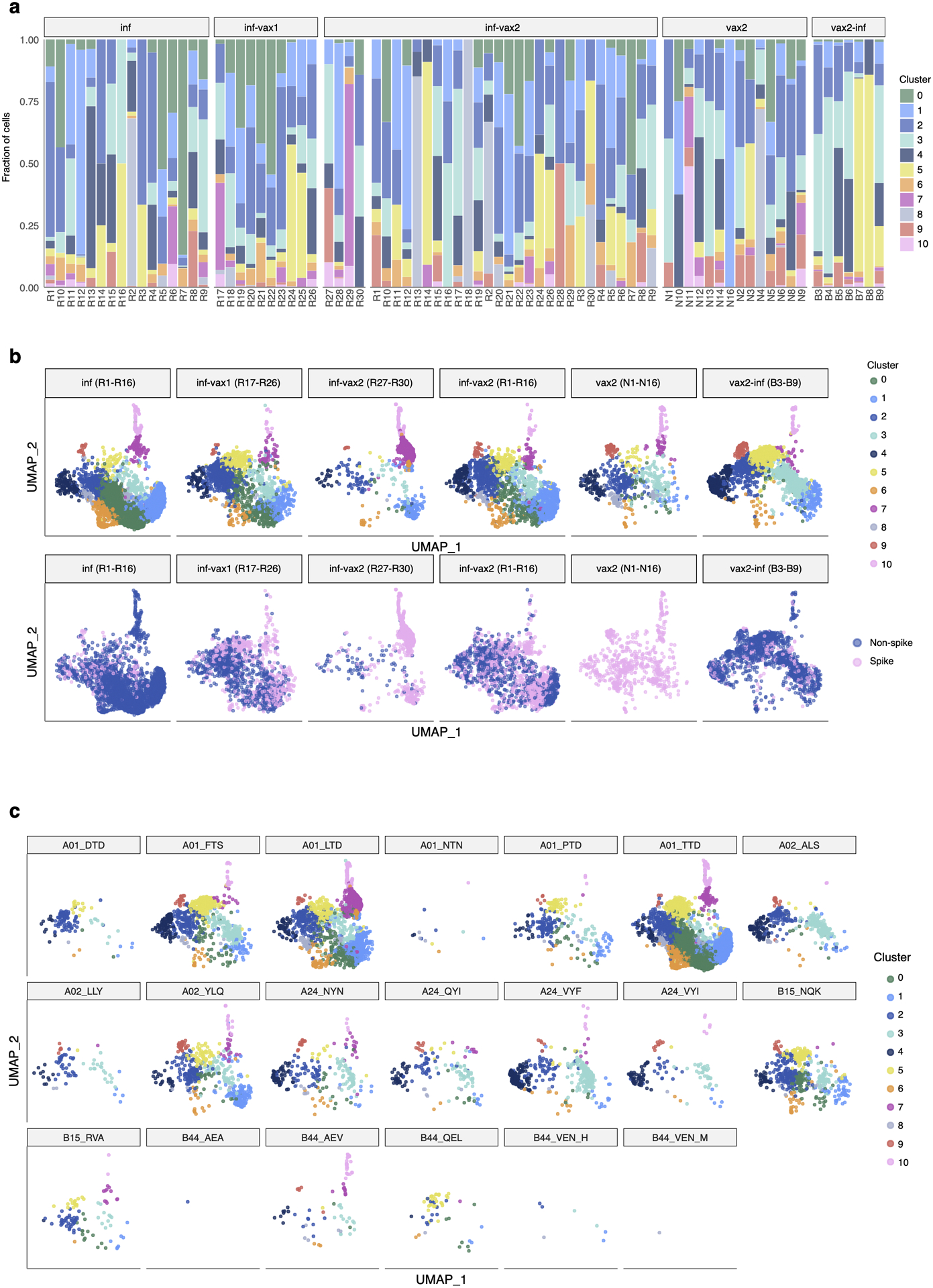
a. Each colored bar represents a fraction of cells from a sample in a given GEX cluster. b. UMAP visualization of cells clustered by similarity of GEX. Each subpanel shows cells from each study group. Top: cells colored by cluster. Bottom: cells colored by spike and non-spike specificity. c. Each subpanel shows cells specific for each of the tested epitopes.