
FIGURE 7.
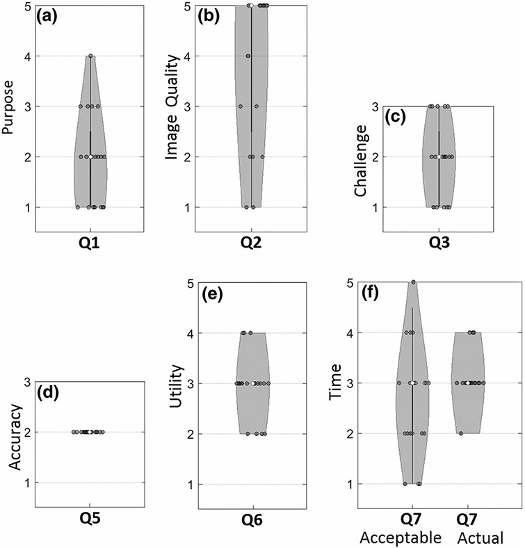
Violin plots showing responses to the clinical study questionnaire (Table 2). The median value is marked as an open circle, and the range is marked by a gray region with width in proportion to the frequency of response.
Official websites use .gov
A
.gov website belongs to an official
government organization in the United States.
Secure .gov websites use HTTPS
A lock (
) or https:// means you've safely
connected to the .gov website. Share sensitive
information only on official, secure websites.
Violin plots showing responses to the clinical study questionnaire (Table 2). The median value is marked as an open circle, and the range is marked by a gray region with width in proportion to the frequency of response.