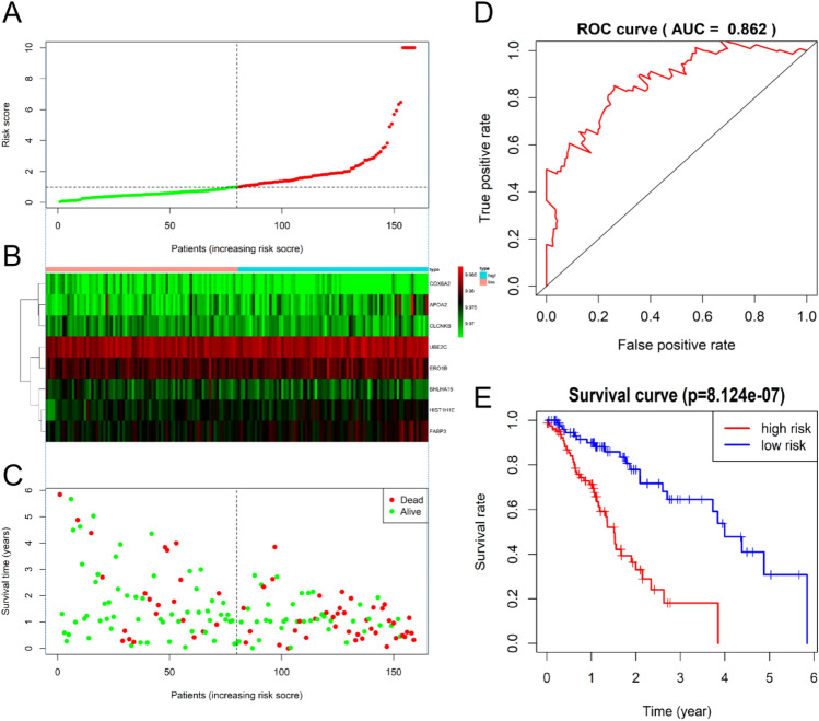
Figure 7.
Performance evaluations of prognostic risk scoring model. (A) The patient's risk score, red indicates high risk and green indicates low risk. (B) Expression heat map of eight genes in high-risk group and low-risk group (Blue represents the high-risk group and red represents the low-risk group). (C) Distribution of survival status of patients in high-risk group and low-risk group (red indicates death and green indicates survival). (D) ROC curve of comprehensive risk scores of eight genes. AUC (area under curve) indicates the area below the ROC curve. The value is between 0 and 1. The higher the value, the better the prediction effect of the model. (E) KM survival curve of patients with the EC with low or high comprehensive risk score of eight genes.

