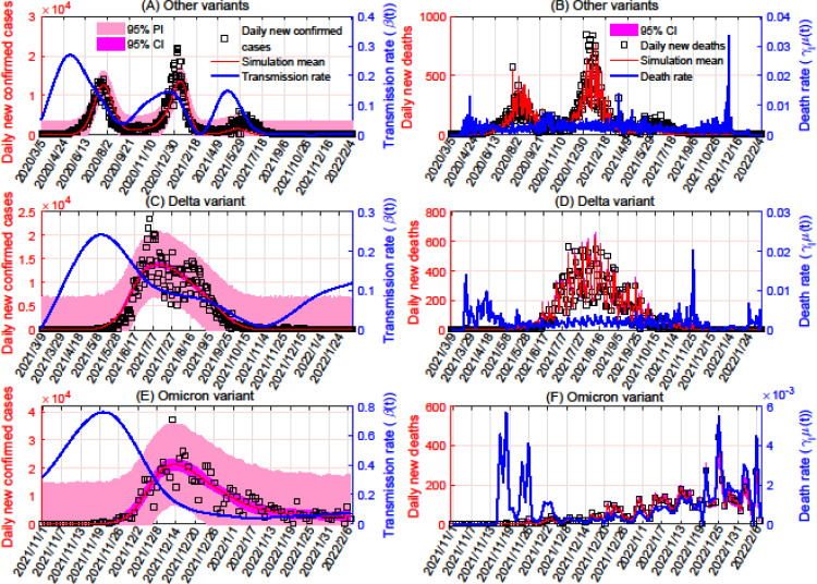
Figure 1.
Model fitting based on data for COVID-19 cases and deaths in South Africa. Panels A, C, and E show the fitting of the transmission rates for variants other than Delta and Omicron, the Delta variant, and the Omicron variant, respectively, based on daily numbers of new confirmed cases of these variants. Panels B, D, and F show the fitting of the variants’ death rates (in the same order), based on daily numbers of new deaths because of each variant. The transmission rates were taken to be cubic spline functions, with numbers of nodes equal to 13 for variants other than Delta and Omicron, seven for Delta, and six for Omicron. In each subplot, the red curve represents the mean simulated number of cases or deaths, and the blue curve represents the transmission or death rate. The 95% PI and CI are plotted in pink and magenta, respectively. CI, confidence interval; PI, prediction interval.

