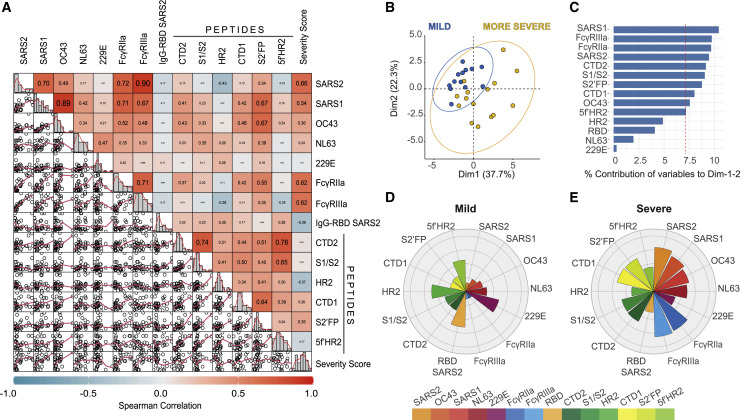
Figure 6.
Multivariable analysis identifies distinct humoral immune profiles in mild versus severe COVID-19
(A) Scatter matrix chart summarizes the Spearman’s correlation (upper) and the scatterplots (lower) between all analyzed variables using the entire cohort (n = 28). The Spearman’s r values are shown inside the colored squares, and the scale of blue-to-red color indicates a negative-to-positive correlation. The small bar graphs (diagonal) represent the distribution of data for each variable.
(B) Biplot shows the principal component analysis (PCA) depicting the mild-scored (n = 13) and more severe-scored (n = 15) COVID-19 patients, according to their severity scores.
(C) The contribution of each variable to PCA for dimension 1 and 2 is represented by bars, and its threshold is indicated as a red dotted line.
(D and E) Polar plots show the different profiles of humoral response for mild and more severe groups. Each bar in the plot represents the mean of Z scores for each variable.

