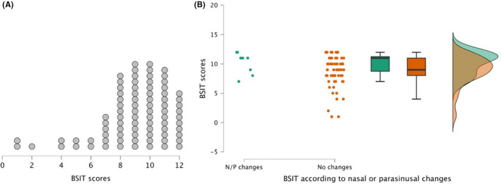
FIGURE 1.

(A) BSIT scores distribution. Each dot represents one patient. (B) Raincloud plot showing the distribution and scores of the BSIT according to the presence (green) or not (orange) of nasal and/or parasinusal changes (N/P). Left plot represents BSIT data from each patient; middle graph represents mean and standard error using a box plot; right graph shows a split‐half violin plot to represent the data distribution using the probability density function of observations
