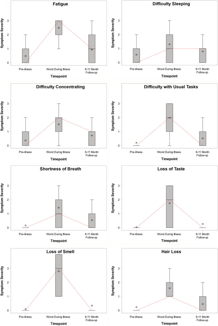
FIGURE 2.

Symptom trajectories from 1 month before COVID‐19 (pre‐illness baseline), during peak acute COVID‐19 (worst during illness), and at long‐term follow‐up (6–11 months after the positive SARS‐CoV‐2 test) for 8 COVID‐19 symptoms. Patients rated their symptoms using a 4‐level Likert scale ranging from 0 (no symptoms) to 3 (severe symptoms). At each time point, a summary of symptom severity among all participants is plotted with a box plot, with the median score represented by the horizontal line, the interquartile range (25th percentile to 75th percentile) represented by the box, the full range represented by the outer brackets, and the mean represented by the star. A dashed line connects the median from each time point to highlight changes in the central tendency over time
