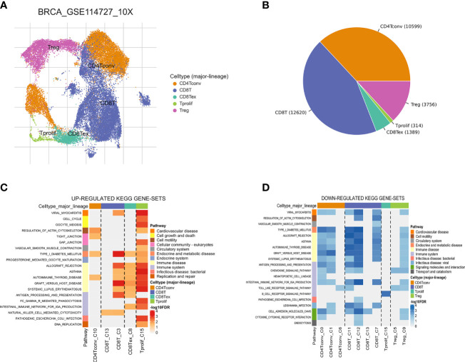
Figure 3.
Breast cancer single-cell data analysis based on the GSE114727 dataset. (A) UMAP plots with cells colored by cell type are displayed. (B) The pie plot shows the cell number distribution of each cell type. Heatmap showing enriched up- (C) or down-regulated (D) pathways identified based on differential genes in each cell type.

