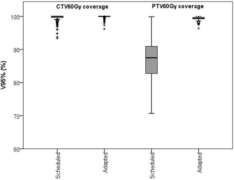
Fig. 1.
Boxplot showing the CTV60Gy and PTV60Gy coverage for the scheduled and the adapted plan. In the boxplot, the inner line denotes the median value, the box the interquartile range and the whiskers the minimum and maximum value excluding the outliers (data points >1.5 times the interquartile range away from the 75th or 25th percentile) that are presented as single markers.

