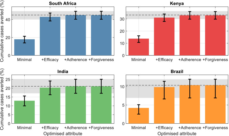
Fig. 3.
Contribution of regimen properties to epidemiological impact. While Fig. 2 shows regimen properties in order of decreasing influence on incidence reductions, this figure shows the quantitative effect of each on impact. In each panel, the leftmost bar shows the impact (cumulative cases averted) of a PT regimen with properties fulfilling only minimal criteria in Table 2. The remaining bars show the impact of successively optimising each single regimen property in turn, starting with the most influential properties shown in Fig. 2. For clarity, only the top four most influential properties are shown. The horizontal dashed line shows the impact arising from a fully optimised regimen, i.e., with all 5 properties assuming optimal values in Table 2). Error bars, and the gray shaded area, show 95% Bayesian credible intervals on respective estimates

