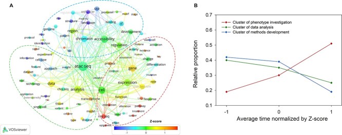
Figure 2.
Keywords correlation analysis and the changes of clusters in ATAC-seq articles. (A) Keyword correlation analysis. The colour of the words represents the average time of occurrence of each keyword in the literature corpus. The colour bar represents the normalized Z-score of average time. The size of the circle behind each word represents its frequency of occurrence. The three ellipses indicate three clusters of highly correlated keywords (abbreviation of TF). (B) The change of clusters over time. Keywords are divided into three clusters according to their relevance. The horizontal axis represents the average time normalized by Z-score. The vertical axis shows its proportion to all the keywords in each cluster.

