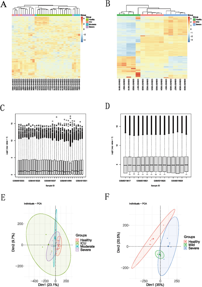
Fig. 7.
(A, B): Heatmap between different severity of COVID-19 and healthy group in the GSE152418 and GSE164805 dataset; the blue box represents the healthy group, the gray box represents the moderate COVID-19 group, the orange box represents the severe COVID-19 group, and the red box represents living in ICU of the COVID-19.group. (C, D) Boxplot for viewing the distribution of sample values in the GSE152418 and GSE164805 datasets. A value-centered on the median indicates that the data is normalized and cross-comparable; (E, F): Principal Component Analysis between different severity of COVID-19 and healthy group in the GSE152418 and GSE164805 dataset.

