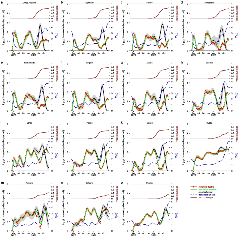
Fig. 2.
Fitting model to data and the effects of vaccination. Here, we used ε = 0.5 namely in the limit of vaccine coverage reaching 100%, the overall infection fatality rate will reduce by half. Red circles show the adjusted deaths, the green curve is the weekly median of 1000 model simulations under the real scenario. The black curve is the weekly median under the counterfactual scenario when vaccination is absent. The blue dash curve is the estimated transmission rate in the form β(t)/γ. (For interpretation of the references to colour in this figure legend, the reader is referred to the web version of this article.)

