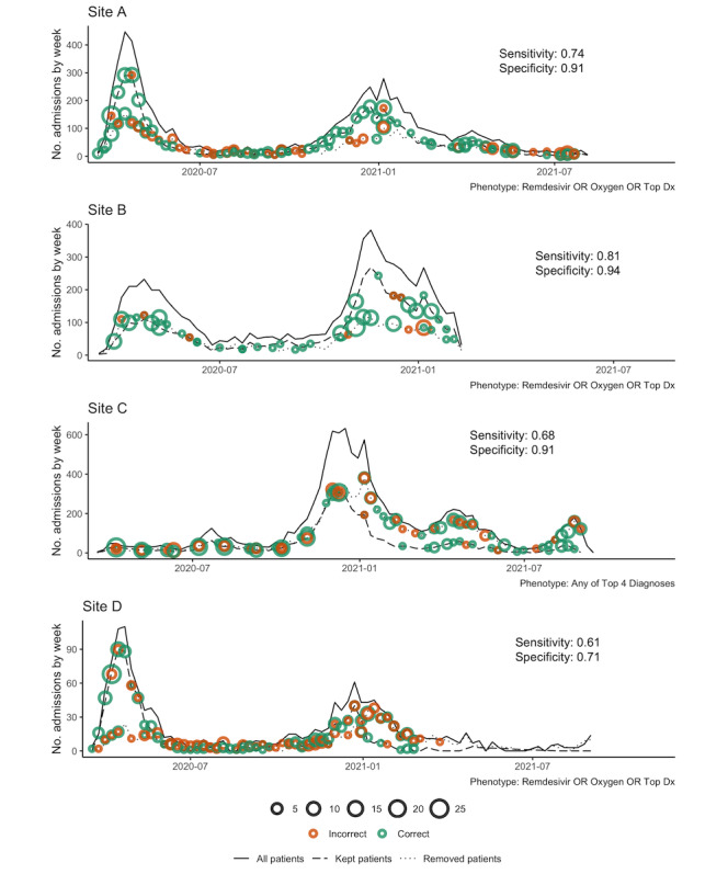
Figure 4.

Performance of the top phenotyping feature sets (Table 7) over time at each site. The y axis is the number of admissions per week, the x axis is the week, and overall sensitivity and specificity are shown on each figure panel. Solid lines show the total number of weekly admissions for patients with a positive SARS-CoV-2 PCR test. Dashed lines show the number of weekly admissions after filtering to select patients admitted specifically for COVID-19 (ie, removing all patients who do not meet the phenotyping feature set criteria). The dotted line shows the difference between the solid line and the dashed line (ie, patients removed from the cohort in the dashed line). Green dots indicate correct classification by the phenotype according to chart review. Orange dots indicate incorrect classification. The dot size is proportional to the number of chart reviews. PCR: polymerase chain reaction.
