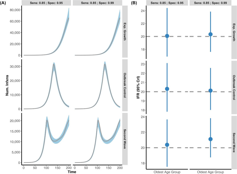
Fig. 3. Posterior daily infections and IFR estimates from simulated data with seroreversion.
A Three simulated epidemics were generated (exponential growth, outbreak control, and second wave) as in Fig. 2, but now with the additional feature that individuals who seroconverted would eventually serorevert. Grey lines indicate the simulated true infection curve under two different serologic tests (Sensitivity: 85%; Specificity 95% vs. Sensitivity: 85%; Specificity 99%). The blue shading represents 100 posterior draws (based on the posterior probability) of the modelled infection curve (using an exponentiated natural cubic spline), where draws were selected based on their posterior probability. B The inferred median and 95% credible intervals (blue) versus the simulated true IFR (grey, dashed line) in the oldest age group for each of the outbreak scenarios with respect to the two different serologic test characteristics. As above, the model accurately captures both the simulated infection curve and the simulated IFR while accounting for seroreversion. For all epidemic scenarios considered, we assume that there are two seroprevalence surveys that range over days 120–130 and 170–180 and that 0.1% of the population was sampled.

