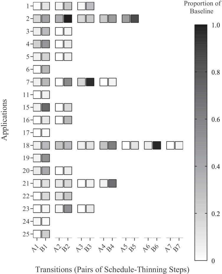
Fig. 7.
Heat map of resurgence data from Briggs et al. (2018). Note. Analysis of 19 data sets with resurgence from Briggs et al. (2018). Each pair of transitions along the x-axis (e.g., A1, B1) reflects the average value prior to (Condition A) and after (Condition B) schedule thinning presented as a proportion of baseline (i.e., the average response rate during the condition divided by the average baseline response rate). Each y-axis value indicates one of the 25 applications of functional communication training

