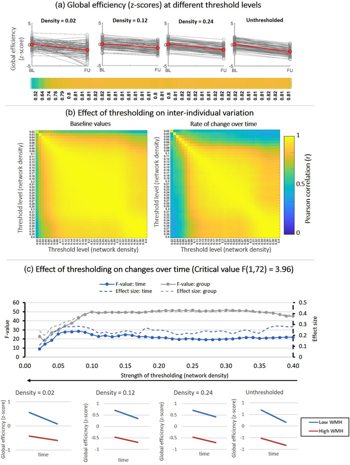
FIGURE 4.

Effect of fixed‐density thresholding on global efficiency. (a) Spaghetti plots showing baseline and follow‐up z‐scores for different threshold levels. The red line represents the group average. The horizontal color bar shows correlations between baseline and follow‐up scores for each threshold level. (b) (Left) Correlation matrix containing Pearson correlations between baseline global efficiency scores of different threshold levels. High correlations indicate that the baseline scores are similar between threshold levels. (Right) Correlations between the rate of change over time obtained at different threshold levels. High correlations indicate that the individual rate of change is similar between threshold levels. (c) Impact of thresholding on the sensitivity to detect changes over time and group differences in patients stratified by WMH volume. (Top) F‐values and effect sizes were calculated using mixed ANOVA with time as within subject factor and group (low vs. high WMH) as between‐subject factor. Left axis corresponds to F‐values and right axis represents the effect sizes for each effect: time (blue), group (gray). (Bottom) Average change over time in global efficiency for patients with low vs. high WMH volume. Patients with high WMH have lower efficiency scores and both groups declined over time
