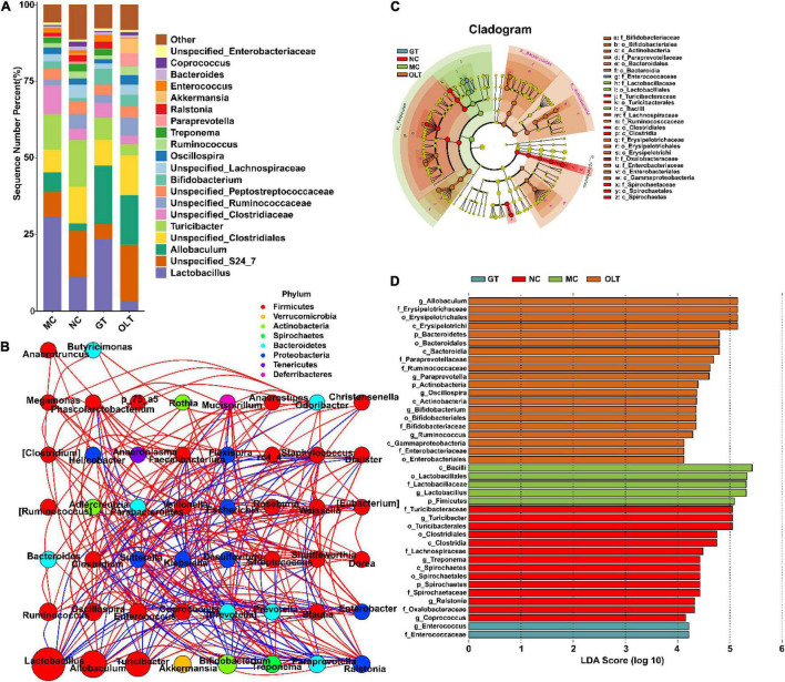
FIGURE 4.
GT and OLT changed gut microbiota structure at the genus level in rats in response to a high-salt diet. (A) Histogram of the relative distribution of gut microbes at the genus level. (B) Microbial interaction network diagram at the genus level based on Spearman correlation analysis. The circle represents a genus, the size represents its relative abundance, different colors represent different phylum classifications, the line between the circles represents a significant correlation between the two bacteria (p < 0.05). The red line represents a positive correlation, and the blue line represents a negative correlation. The thicker the line, the greater the absolute value of the correlation coefficient. (C) Cladogram based on LEfSe analysis. The cladogram corresponds to different levels of intestinal microbial classification from the inside to the outside, and the connection between the levels represents the belonging relationship. Each circled node represents a classification of bacteria, yellow nodes represent insignificant differences between groups, and non-yellow nodes represent that the bacterium is characteristic microorganisms of the corresponding group (significantly higher abundance in this group). The colored fan-shaped area marks the subordinate classification intervals of the characteristic microorganisms. (D) LDA histogram based on LEfSe analysis. Each horizontal column represents a kind of bacterium, and the length of the column corresponds to the LDA value. The higher the LDA value, the greater the difference. The color of the column corresponds to the characteristic microorganisms of the bacterial group (the higher abundance in the corresponding group).

