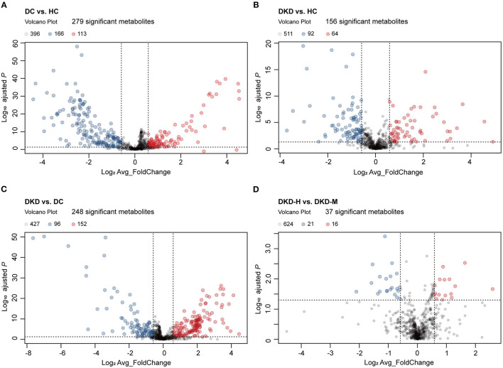
Figure 3.
Visualization of serum metabolites difference between healthy controls and diabetic patients. (A) Volcano plot comparing serum metabolites in diabetic controls (DC) (n = 30) and healthy controls (HC) (n = 30). The vertical dashed lines indicate the threshold for the 1.5-fold abundance difference. The horizontal dashed line indicates the P = 0.05 threshold. X-axis, log2[average_FoldChange]. Y-axis, –log10[adjusted-P value]. P-value computed using a two-sided unpaired t-test without adjustment for multiple comparisons. (B) Volcano plot comparing serum metabolites in diabetic kidney disease patients (DKD) (n = 29) and healthy controls (HC) (n = 30). Refer to (A) for the description of the figure. (C) Volcano plot comparing serum metabolites in diabetic kidney disease patients (DKD) (n = 29) and diabetic controls (DC) (n = 30). Refer to (A) for the description of the figure. (D) Volcano plot comparing serum metabolites in diabetic kidney disease with heavy proteinuria (DKD-heavy) (n = 17) and diabetic kidney disease with moderate proteinuria (DKD-moderate) (n = 12). Refer to (A) for the description of the figure.

