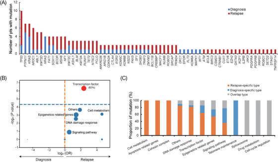
FIGURE 1.

Comparative analysis of mutation distribution in 21 patients with diagnosis‐relapse paired samples. (A) Histogram showing the comparison of mutated genes at diagnosis and relapse. Mutation at diagnosis and relapse is colored blue and red, respectively. (B) Volcano plot showing the comparison of functional pathways in which the mutated genes are involved at diagnosis and relapse. The horizontal axis represents the magnitude of association (log2 odds ratio), and the vertical axis indicates the ‐log2 p‐value. Each circle shows a functional pathway and the size of each circle indicates the frequency of the mutated gene involved in functional pathways. (C) Distribution of three mutation types, including diagnosis‐specific type (only present at diagnosis), relapse‐specific type (only present at relapse) and overlap type (present at both diagnosis and relapse) according to different pathways
