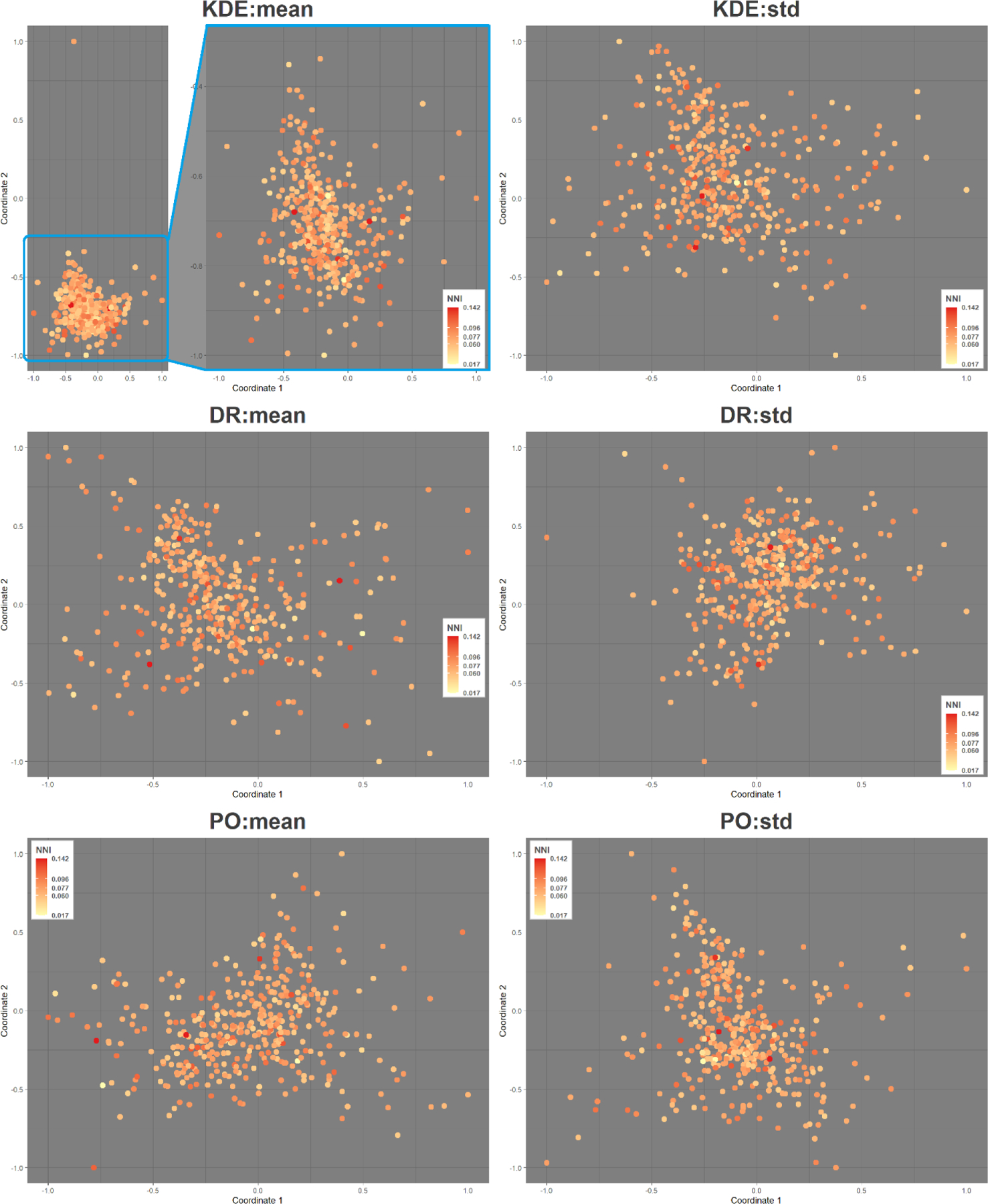
Figure 5.

Multidimensional scaling of participants’ exposure based on the cosine similarity considering the 12 exposure scenarios (3 mobility data types * 4 environmental data layers). Each point in the scatter plot represents one participant and is colored by the nearest neighbor index (NNI). Colors range from GPS data being clustered on NNI index (yellow) to dispersed (red). For KDE:mean (top left), a zoom-in of the main cluster is shown.
