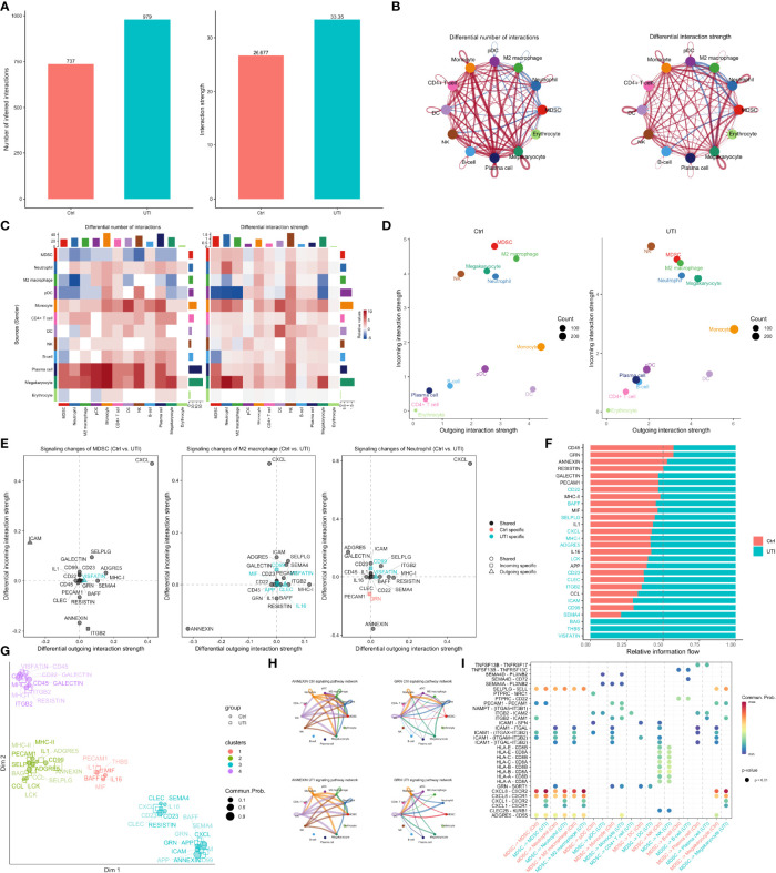
Figure 6.
Comparisons of cell-cell communications between UTI and control groups. (A) The number and strength of inferred communication links between UTI and control groups. (B) Circle plot showing differential cell-cell communication networks between UTI and control groups. The width of edges represents the relative number of interactions or interaction strength. Red (or blue) colored edges represent increased (or decreased) signaling in the UTI compared to control. (C) Heatmap showing differential number of interactions or interaction strength in the cell-cell communication network between control and UTI groups; red color indicates increased signaling in the UTI compared to control. The top colored bar plot represents the sum of column of values displayed in the heatmap. The right colored bar plot represents the sum of row of values. (D) Scatter plots showing the dominant senders (sources) and receivers (targets) in a 2D space. x-axis and y-axis are respectively the total outgoing or incoming communication probability associated with each cell group. Dot size is proportional to the number of inferred links (both outgoing and incoming) associated with each cell group. Dot colors indicate different cell groups. (E) 2D visualization of differential outgoing and incoming signaling associated with one cell group. Positive values indicate the increase in the UTI dataset while negative values indicate the increase in the control dataset. (F) Ranking signaling networks based on the information flow. Significant signaling pathways were ranked based on differences in the overall information flow within the inferred networks between sepsis and septic shock. The top signaling pathways colored red are enriched in control, and these colored green were enriched in UTI. (G) 2D visualization of the joint manifold learning of signaling networks from UTI and control datasets. Each dot represents the communication network of one signaling pathway. Dot size is proportional to the overall communication probability. (H) Circle plot showing the inferred signaling network at UTI and control groups. Edge width represents the communication probability, and the edge colors are consistent with the color of the sender cell type. (I) Comparisons of significant interactions (Ligand-Receptor pairs) between UTI and control, which contribute to the signaling from MDSC to M2 macrophage, monocyte, megakaryocytes, and neutrophil subpopulations. Dot color reflects communication probabilities and dot size represents computed p-values. Empty space means the communication probability is zero. p-values are computed from one-sided permutation test.

