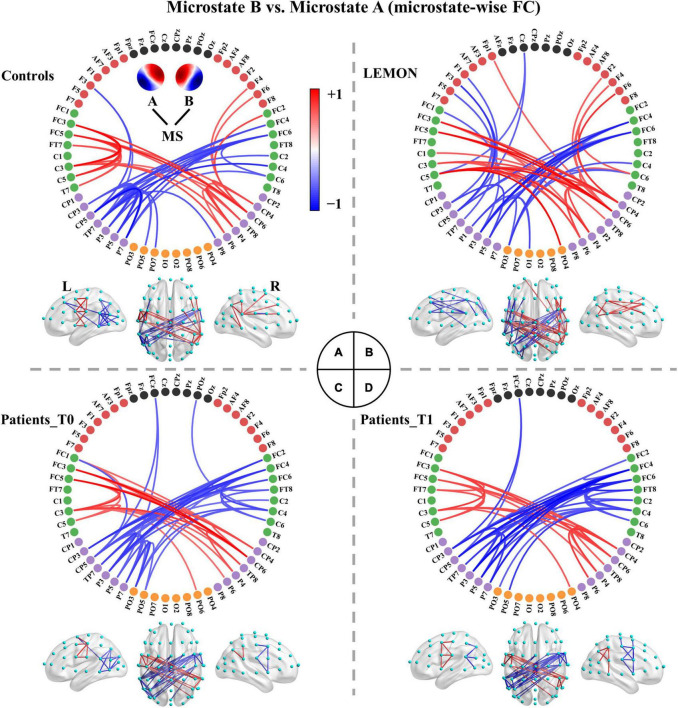
FIGURE 3.
Comparisons between functional connectivity of microstates A and B for the four groups. (A) Healthy controls. (B) LEMON. (C) Patients at T0. (D) Patients at T1. For visual clarity, only the top 50 connections (according to absolute t-values) in the connected components with significant differences (p < 0.05, NBS-based method corrected) are displayed in the figure. The red color indicates greater connectivity for microstate B vs. microstate A, while the blue color indicates greater connectivity for microstate A vs. microstate B. Color depth represents the size of the connection difference (t-value). The complete connected components are provided in the first column of Supplementary Figure 3.

