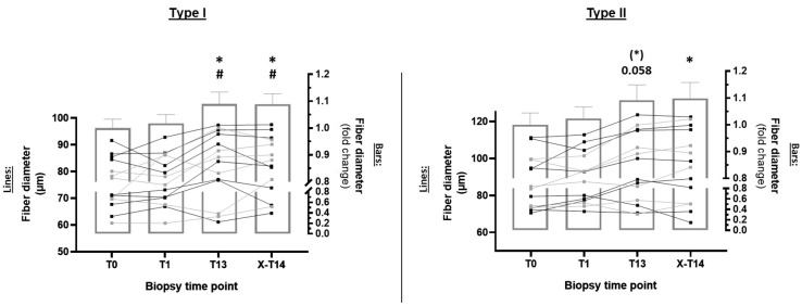
Figure 3.
Determination of myofiber hypertrophy via analysis of type I and type II fiber diameter. Bar graphs display the mean ± standard error of the mean. The right x-axis represents the fold change in fiber diameter (T1, T13, and X-T14 compared to T0). Normalization to the baseline (T0) was performed by dividing all time points of individual subjects by the total average of T0. Lines (left x-axis) represent the absolute change in an individual subject’s fiber diameter (µm). Differently colored lines in the diagram represent subjects from CO (gray dots and lines) and PR (black dots and lines). * p < 0.05 with respect to T0; # p < 0.05 with respect to T1.

