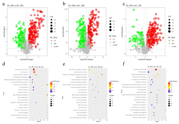
Figure 3.
(a–c) Volcano plot of the metabolic profile at stage 3 (S3) and stage 1 (S1). The red, green and grey circles represent up-regulated, down-regulated, and non-significant metabolites, respectively. The horizontal axis represents the folded change in metabolite content, and the vertical axis represents the level of significance of the difference. Screening criteria are described in the Methods section. (d–f) KEGG pathway enrichment analysis of differential metabolites at S3 and S1. The horizontal coordinate of the graph is the ratio of the number of differential metabolites annotated to the KEGG pathway to the total number of differential metabolites, and the vertical coordinate is the KEGG pathway. The size of the dots represents the number of metabolites annotated to the KEGG pathway, and the color gradient from red to purple represents the significance of the size of enrichment. Sample 1 vs. Sample 2 represents the different metabolites in the former compared to the latter.

