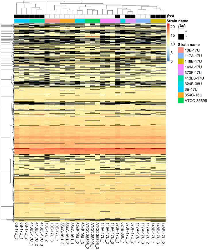
Figure 1.
Heat map of the normalized abundance for identified and quantified proteins. The colors in the map display the value of the arcsinh transformed normalized abundance value plus one for individual proteins (represented by a single row) within each experimental sample (represented by a single column). Expression values are shown as a color scale, with higher values represented by red and lower represented by blue. The normalized abundance values of “NA” are represented by black. The ftxA genotypes (+ or −) [14] and different strains are color coded.

