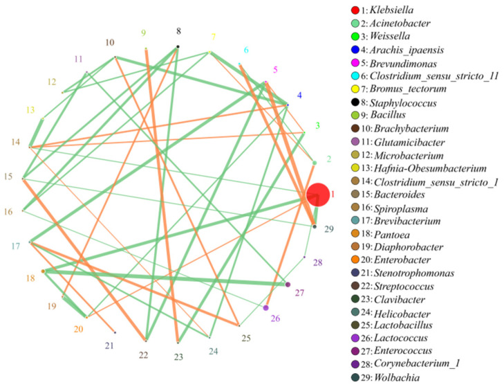
Figure 8.
Correlation analysis of microorganisms at the genus level. The circles represented the genera, the size of the circles represented the average abundance, the lines represented the correlation between two species, the thickness and thinness of the lines represented the strength of the correlation, orange represented a positive correlation and green represented negative correlation. The correlation analysis of the top 30 genera in abundances are shown on the right.

