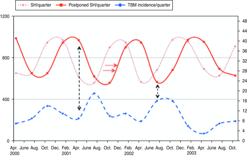
Fig. 1.
[colour online]. Incidence rate of tuberculous meningitis (TBM) (dashed curve; right y-axis) and sunshine hours (SH; dotted curve; left y-axis) are shown per quarter (=3 months). The solid curve (postponed sunshine hours) illustrates the inverse association with the incidence rate of TBM. Low amounts of sunshine during winter months lead to an increase in TBM incidence (black arrows). For reasons of clarity only part of the graph is shown.

