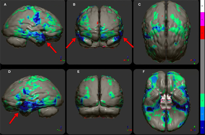
Figure 10.
The patient's data is compared to a normative database (N = 68). A map of statistically significant differences can be generated using the Oasis software by Segami, Inc. Here, the color scale indicates gray for areas that do not differ significantly from the normative database. In contrast, areas of green, light blue, and dark blue represent areas of more than 2, 3, and 4 SD below the mean perfusion of the normative database, respectively. Statistically significant increases in perfusion are illustrated in the red color scale. Decreased perfusion in the bilateral temporal cortex and bilateral orbitofrontal cortex can be appreciated. Map is displayed in the following views: (A) right lateral, (B) frontal, (C) superior, (D) left lateral, (E) posterior, and (F) inferior with cerebellum removed.

