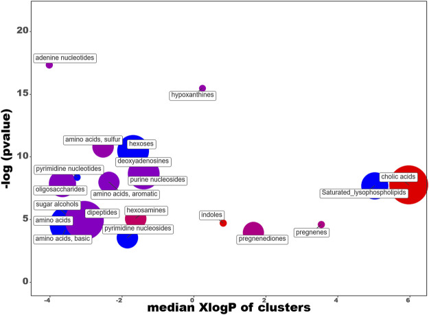
FIGURE 9.
ChemRICH diagram according to the diet. Each disc reflects a significantly altered family of metabolites. These groups are developed from chemical similarities highlighted by a hierarchical Tanimoto map (not shown) accessible in the ChemRICH program. Enrichment p-values are given by the Kolmogorov–Smirnov test and displayed along the ordinate, with p values transformed in–log10. Disc sizes varies with the total number of metabolites. Red discs present groups of overexpressed metabolites in rats fed maize while blue ones show overexpressed compounds in rats fed soy. Purple color represents both increased and decreased metabolites. For example, more cholic acids are found in the feces of rats fed with maize compared to those fed with soy. Metabolite families are also scattered according to their increasing hydrophobicity (or decreasing hydrophilicity), from left to right along the abscissa (expressed as log P value).

