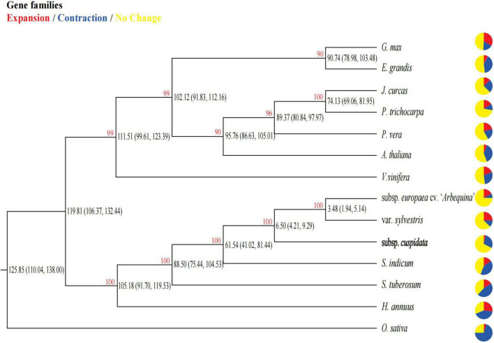
FIGURE 2.
Phylogenetic relationship and divergence time among species. Pie charts show the proportion of gene families that are expanded (red), contracted (blue), and conserved (yellow) across all gene families in the 14 species. The red number in each node represents the bootstrap value. The number in parentheses in each internal node indicates the estimated divergence time interval (in millions of years).

