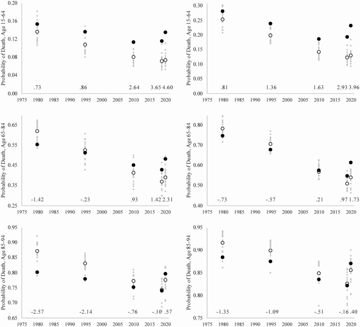
Figure 2.
Probability of death at ages 15–64, 65–84, and 85–94 among female populations and male populations. Note: Black circle indicates the United States, white circle indicates peer country average, and small gray circles denote individual peer countries. Numbers above x-axis indicate Z-score for U.S. probability relative to peer average probability.

