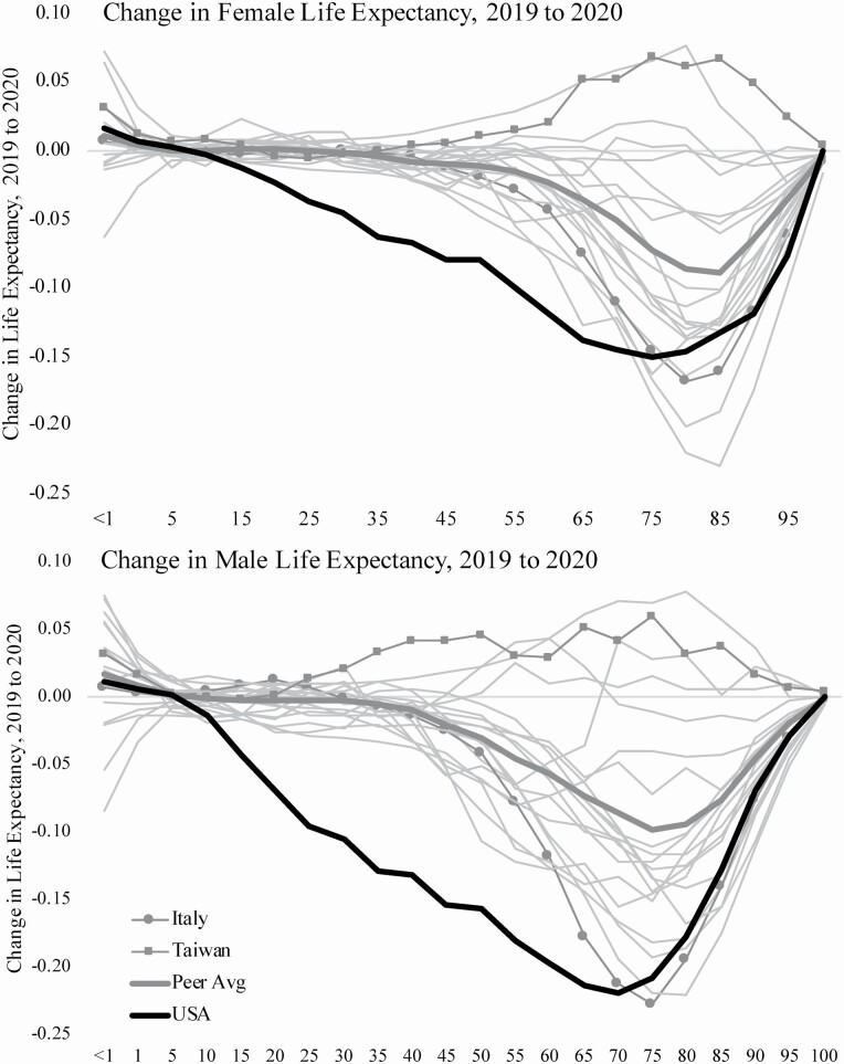
Figure 4.
Contributions of age-specific deaths to changes in life expectancy between 2019 and 2020 in the United States and peer countries. Note: Bolded black line indicates the United States, bolded gray line indicates average of peer countries, square markers indicate Taiwan, circle markers indicate Italy, and light gray lines indicate other peer countries.

