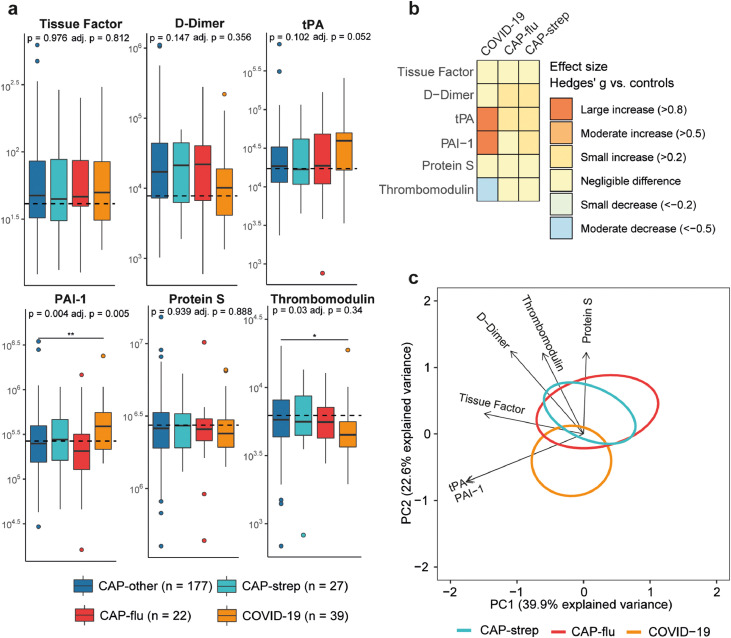
Figure 4.
Biomarker levels reflective of coagulation in patients with community-acquired pneumonia with different microbial aetiologies. a) Boxplots comparing markers of coagulation between the CAP groups. The Y-axis depicts biomarker concentrations in pg/ml (prior to Box-Cox transformation). The median value for control subjects is shown as a dashed line. The P-value listed in each boxplot is obtained from the White-adjusted ANOVA, the adjusted (adj.) P-value was obtained from the White-adjusted ANCOVA model including age, sex, and disease severity scores as covariates. The stars depict the significance of the post-hoc pairwise Games-Howell tests performed after a significant ANOVA. *P<0·05, **P<0·01. b) Heatmap depicting the Hedges’ g between the disease groups and controls for all markers of coagulation. c) Principal component analysis of all markers of coagulation. X-axis label shows the percentage of explained variance on principal component 1, Y-axis label shows the percentage of explained variance on principal component 2. The ellipse indicates the central 10% of the groups. The arrows indicate the direction (arrow orientation) and strength (arrow length) of the correlation between each marker and the principal components.

