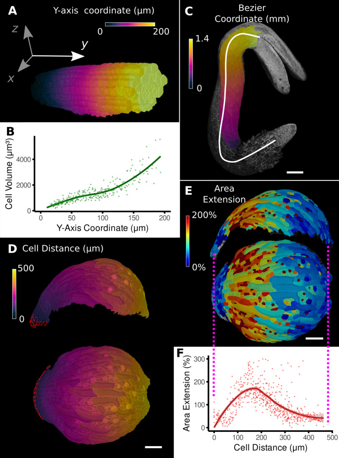
Figure 2. Methods to define positional information and their application to data analysis in plant organs.
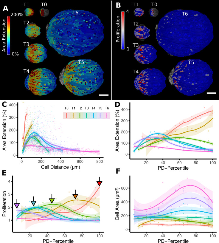
(A) Y-axis aligned A. thaliana root. The cells are colored according to the y-coordinate of their centroid position. (B) Plot of cell volumes of epidermis cells of the root in (A) along the y-axis with a fitted trend line. (C) Seedling of A. thaliana with a surface segmentation of the epidermis. A manually defined Bezier curve (white) allows the assignment of accurate cell coordinates along a curved organ axis. (D) Side and top views of an A. thaliana sepal with a proximal-distal (PD) axis heat coloring. The cell coordinates were assigned by computing the distance to manually selected cells (outlined in red) at the organ base. This method allows organ coordinates to be assigned in highly curved tissues. (E) Side and top views of (D) with a heat map coloring based on cellular growth to the next time point. (F) Plot summarizing the growth data of (E) using the PD-axis coordinates from (D). See Figure 2—figure supplement 1 for the analysis of the complete time-lapse series. Scale bars: (A) 20 μm; (C) 100 μm; (D, E) 50 μm. See also user guide Chapter 23 ‘Organ-centric coordinate systems’ and tutorial video S3video S3 available at https://doi.org/10.5061/dryad.m905qfv1r.


