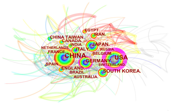
Figure 3.
Spatial distribution map of countries/regions. The size of the node reflects the frequencies, and the links indicate the collaboration relationships. The color of the node and line represent different years. The outermost purple ring represents the centrality level, and the nodes with high centrality are considered to be the key points in the research field.

