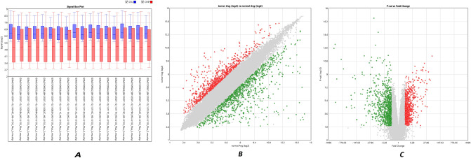
Figure 2.
Normalization and gene filtering of the microarray data. (A) Box plot gene expression distribution in each patient and data normalization of microarray samples. For each microarray sample, blue box plot (CEL) shows microarray gene expression distribution before normalization, and red box plot (CHP) represents gene expression distibution after normalization. (B) The scatter plot of DEGs (differentially expressed genes). It shows varience of the average gene expression in normal versus tumor patients. (C) Volcano plot of DEGs (differentially expressed genes) between gastric adenocarcinoma samples versus paired normal tissue. It shows signficant gene expression based on ther p-value and fold change. Note: In (B) and (C), red and green dots show upregulated and downregulated genes, respectively. Besides, gray nodes are the DEGS whose fold change is below the determined limit in the study.

