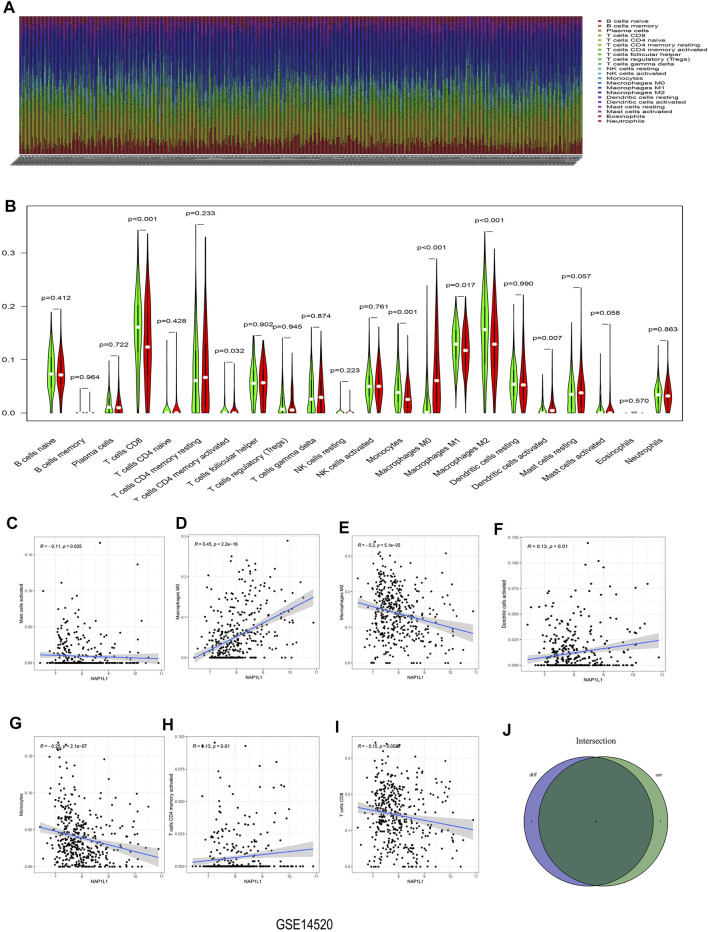
FIGURE 7.
Analysis of immune infiltration in the GSE14520 dataset. (A) The bar graph containing the 22 immune cells. (B) The violin graph containing the 22 immune cells. (C) The relationship between NAP1L1 and activated mast cells. (D) The relationship between NAP1L1 and M0 macrophages. (E) The relationship between NAP1L1 and M2 macrophages (F) The relationship between NAP1L1 and activated dendritic cells. (G) The relationship between NAP1L1 and monocytes. (H) The relationship between NAP1L1 and activated memory CD4 T cells. (I) The relationship between NAP1L1 and CD8 T cells. (J) The Venn graph was utilized to picture the meaningful immune cells between the violin plot and the correlation graph.

