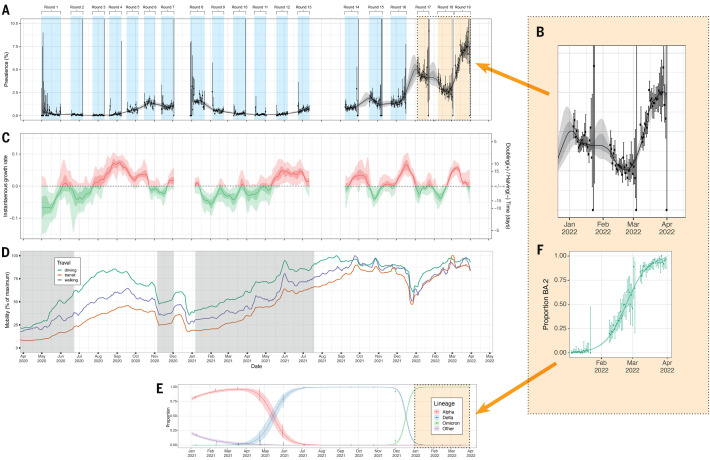
Fig. 1. Overview of SARS-CoV-2 swab-positivity across the 19 rounds of REACT-1 study.
(A) P-spline model fit to all rounds of REACT-1. Shaded grey region shows 50% (dark grey) and 95% (light grey) posterior credible interval for the P-spline model. Weighted prevalence of swab-positivity (Y axis) is represented for each day of sampling (X axis). Weighted observations (black dots) and 95% credible intervals (vertical lines) are also shown on an ordinal scale. (B) Blow up of the P-spline model for rounds 16 to 19. (C) Instantaneous growth rate for each of the swab days of the REACT study from the log-transformed P-spline. Posterior median estimates are represented as a smoothed solid line and 50% (dark shaded regions) and 95% (light shaded regions) are plotted in red for positive and in green for negative growth rates. (D) Daily Apple mobility indices for walking, driving and transit from phone location data for the duration of the REACT-1 study (1 May 2020 to 31 March 2022). We report seven-day moving averages of the indices and have scaled them to the maximum observed during the study period. Grey shaded regions represent periods when lockdown was implemented in England. (E) Daily proportion of Alpha (red), Delta (blue), Omicron (green) and other (purple) SARS-CoV-2 lineages across rounds 8 to 19 of the REACT-1 study. Mean daily proportions (solid lines) and their 95% credible intervals (shaded regions). (F) Daily proportion of BA.2 and its sub-lineages (vs all other Omicron sub-lineages) infections among positive swabs with determined lineage and at least 50% genome coverage in round 17, round 18 and round 19. Point estimates are represented (dots) along with 95% confidence intervals (vertical lines). Smoothed estimates of the proportion are also shown (solid line) together with their 95% credible intervals (shaded regions).

