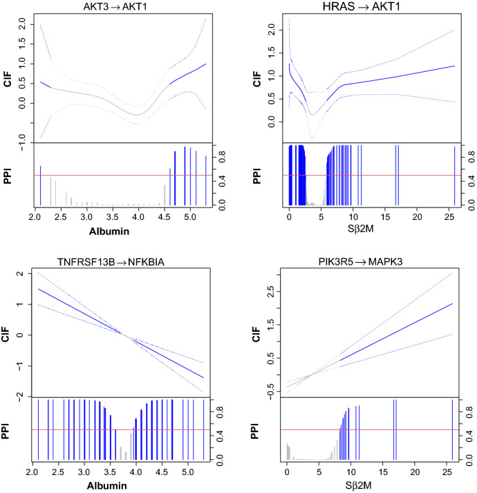
Fig. 3.
Nonlinearly (top) and linearly (bottom) varying effects for the multiple myeloma dataset analyzed by the graphical regression model. For each plot, the estimated conditional independence functions (solid) with 95% credible bands (dotted) are shown in the top portion and marginal posterior inclusion probabilities are shown in the bottom portion. Red horizontal line is the 0.5 probability cutoff. Blue (grey) lines and curves indicate (in)significant coefficients

