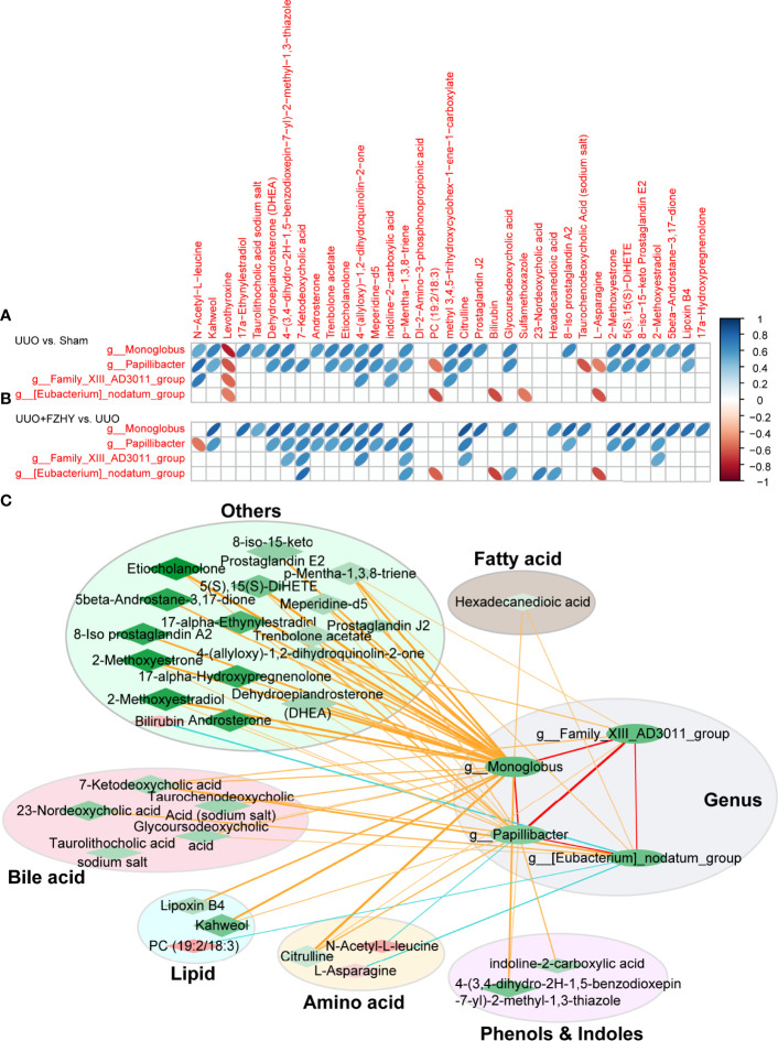
Figure 6.
Correlation analysis between differential genus and differential metabolites. The correlation heatmaps for the UUO vs. sham groups (A) and the UUO+FZHY vs. UUO groups (B) were analyzed by Pearson correlation coefficient. The “blue” bar represents positive correlation, and the “orange” bar represents negative correlation. (C) The correlation network between 4 genus-level bacterial taxa and 31 metabolites by the Cytoscape software. The nodes of the network represent the genera (green ellipse) and the metabolites (red diamond and green diamond). “Red” represents upregulation and “green” represents downregulation. The node color represents the level of difference (logFC) between the two groups (FZHY vs. UUO), and the darker the color, the greater the difference. The diamond size represents the −log10 (P_value) of correlation; the larger of the significance, the higher of the correlation, and vise versa. The edges represent the degree of correlation between the two nodes. The color of the edge represents the correlation between the two; “yellow” and “red” represent positive correlation and “blue” represents negative correlation. The thickness of the edge represents the degree of correlation, and the thicker the edge, the higher the correlation. The metabolites are divided into six categories, namely, bile acid metabolites (light pink ellipse), lipid metabolites (light blue ellipse), amino acid metabolites (light yellow ellipse), phenol and indole metabolites (light purple ellipse), fatty acid metabolites (light gray ellipse), and other metabolites (light green ellipse).

