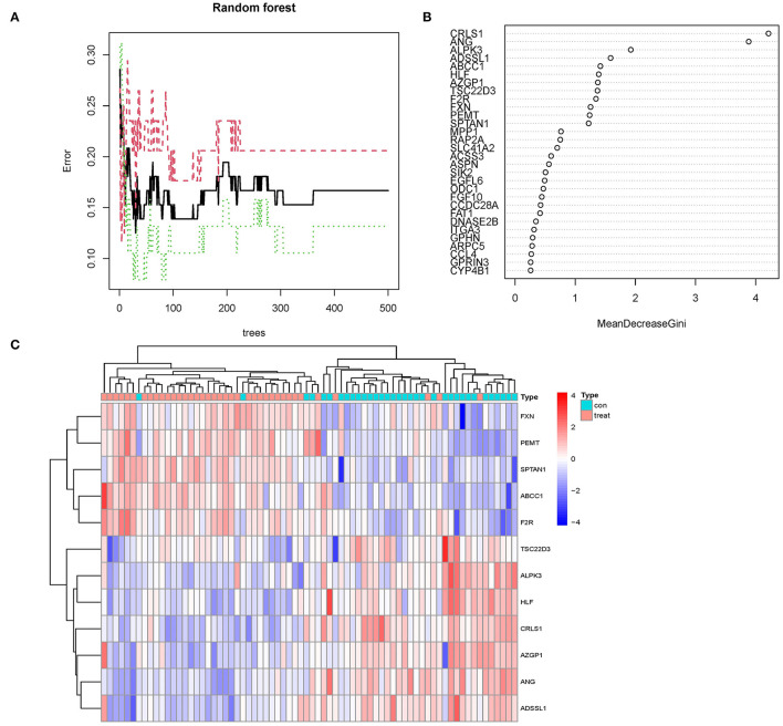
Figure 5.
(A) The mistake rate is influenced by the number of selection trees. The amount of decision trees is shown on the x-axis, while the mistake rate is represented on the y-axis. (B) Random forest classifier results using the Gini coefficient approach. (C) Unsupervised clustering heatmap demonstrating the hierarchical clustering formed by the twelve significant genes created by the random forest in the GSE24881 and GSE25403 merging dataset. The red band on the upper portion of the heatmap suggests normal samples, while the blue band indicates obesity disorder samples. Red color demonstrates genes with elevated expression in the samples, the blue color implies genes with low or undetectable in the samples.

