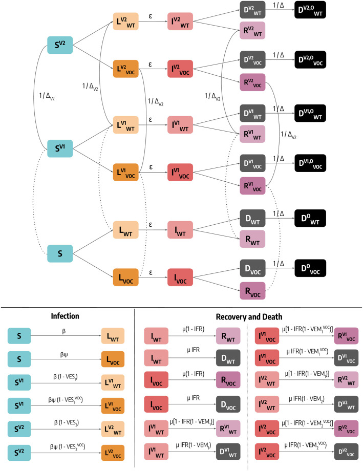
Fig 6. Schematic representation of the epidemic model and transitions between compartments.
For simplicity, we represent the model for a single age group. Dashed lines indicate data-driven transitions linked to vaccination status, solid lines indicate that simulated transitions. In the bottom of the figure we report the rate of transitions related to both infection and and recovery/death.

