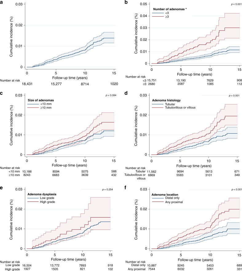
Fig. 2. Cumulative incidence curves (%) for proximal colon cancer within 15 years of follow-up.
The graphs show Kaplan-Meier survival curves for proximal colon cancer incidence: a overall; b by the number of adenomas; c by adenoma size (mm); d by adenoma histology; e by adenoma dysplasia; f by adenoma location. A different scale has been used in the graph for adenoma number and is highlighted by an asterisk. The p-values presented are for the log-rank test to compare curves for subgroups of each adenoma characteristic. The 95% CIs for each curve are shown as shaded bands.

